GOT A UI/UX
DESIGN PROJECT?

Clutter-free Design for an Automation Testing Tool – Appachhi
Domain: Technology
Platform: Web
Service: UX and UI Design
the challenge
AppAchhi is a deep testing automation tool that came to us to revamp their flagship product.
Being a functional and performance testing automation tool with the capability to create, run, and manage deep testing for a multitude of applications, they needed a clean, clutter-free UI and an extremely seamless UX(learn more about clutter-free designs). They wanted to hold and display all information and functionalities in the most intelligible way possible, making all tests and reports easily consumable for the users.
the approach
AppAchhi wanted to boost efficiency for all businesses by measuring testing, running comparisons, monitoring application speeds, analyzing memory leaks, and recording logs of crashes, clicks, and screenshots. All of this would amount to faster processing and a better experience for users across the products.
UX Strategy
AppAchhi was designed to cater to multiple stakeholders. Our main aim was to build an application that facilitated an easy use of the functionalities and increased conversion rates across all roles.
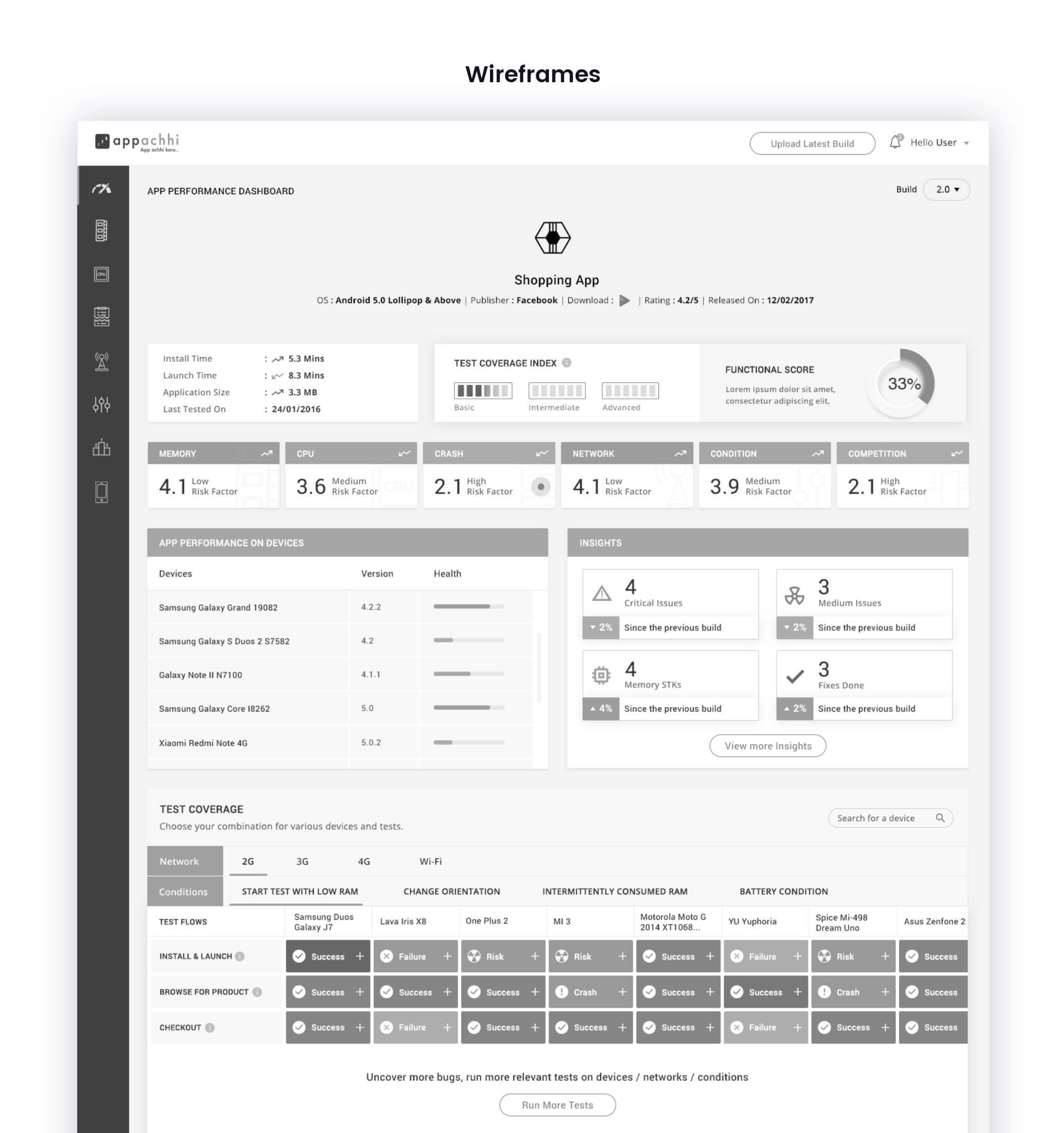
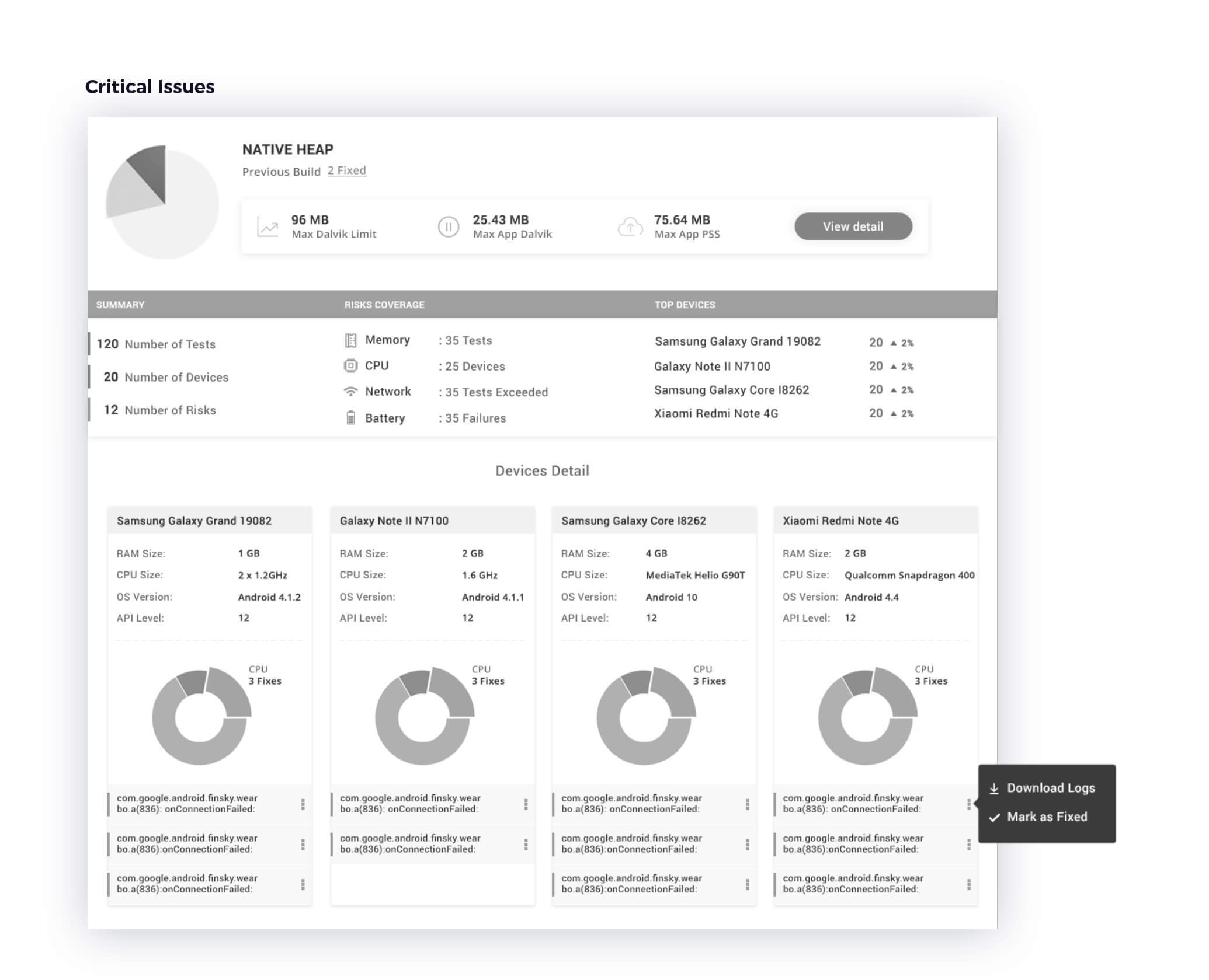
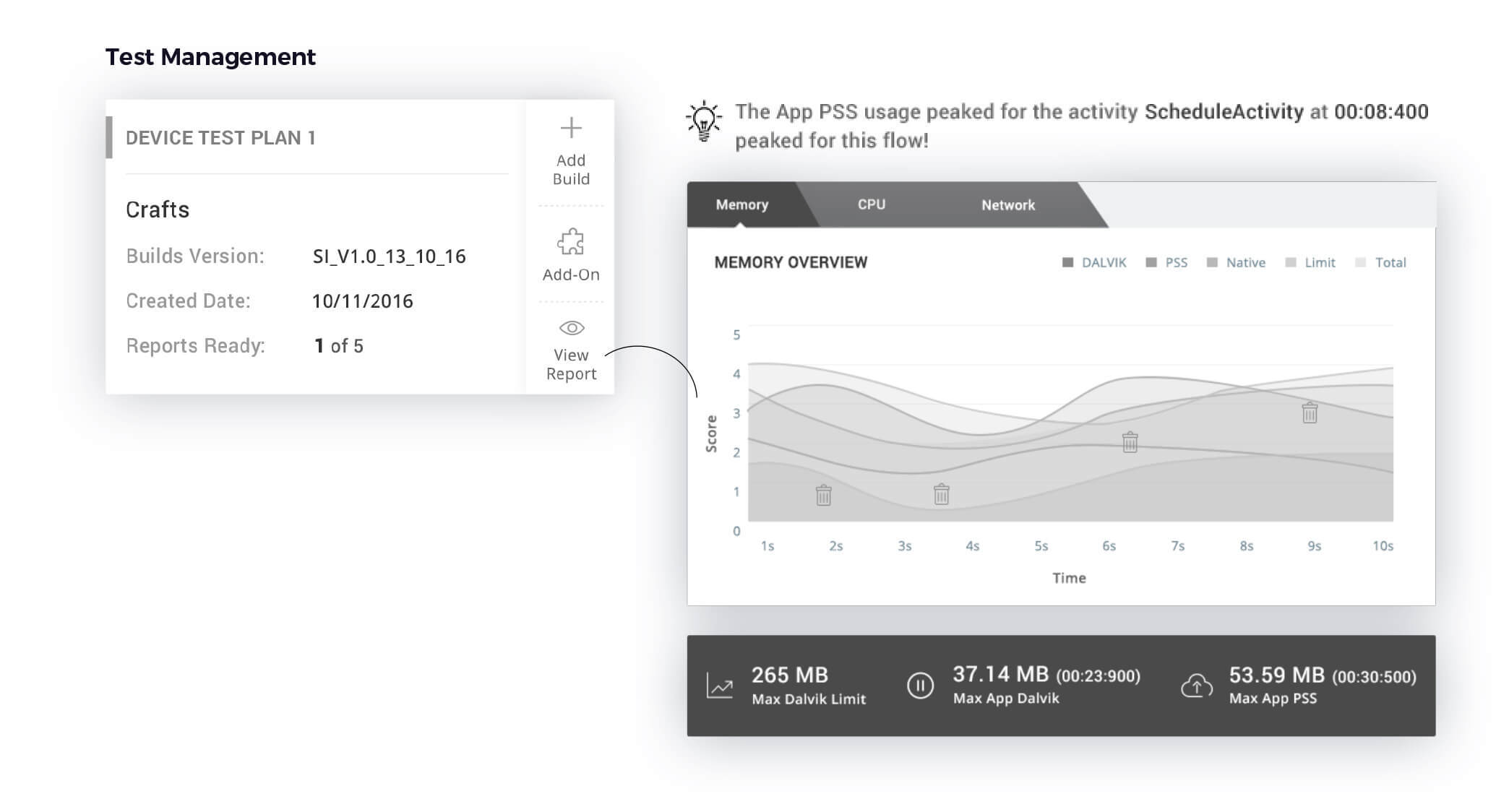
After delving into the business needs, we found out that Appachhi heavily relied on data-driven insights for their results. This could result in a lack of clarity if the results were not presented properly. To mitigate that problem, we designed specific sections to display different reports and data as to not overburden the users and keep user interest intact. To help the users derive value, we added a section for the users to customize testing plans as per their requirements for specific parameters and offered them detailed insights after results were generated on how their application could improve and rank higher in their particular domain. This not only helped different stakeholders gain more out of the application than they had bargained for but also personalized their experience with it.
UI Design
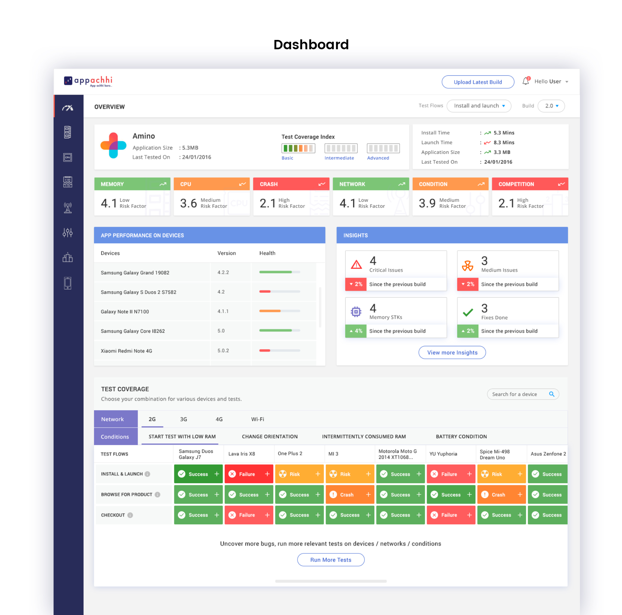
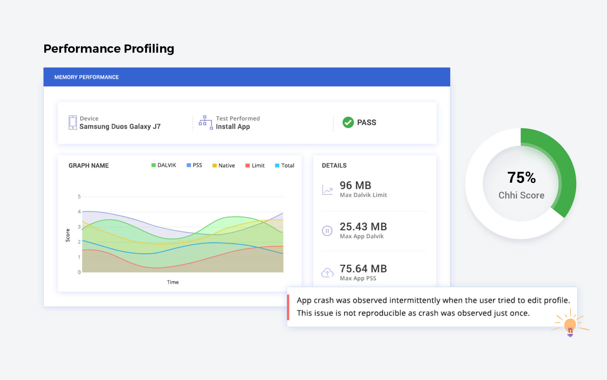
AppAchhi had a range of devices of different brands and builds to test the application for RAM usage, network, and CPU load. To make this representation easier, the design strategy we executed for AppAchhi had simplicity at its core – the aim was to minimize cognitive load and display information clearly. This was done with the help of design that relied on the use of vibrant graphics for representing complicated and extensive test results and reports. This ensured a clear form of communication and easy comprehension without overburdening the user, along with UI and UX related reports represented separately, making it simple for the user to identify them. We also used different colors to represent different test sections so that they were easily distinguishable.

the result
The platform was successfully released, guiding businesses along on their app performance while allowing AppAchhi to show complex information to their clients in a simple, visual way, and implement quick feedback, much to their clients’ delight.
Getting results & delivering on the promise is what we do best
“We chose Yellowchalk for our product design to create a global impact. They understood our requirements – worked with us methodically – understood our customer needs – made us think deeper about our own product. Plus, the design came out very well.”
Pradeep
Founder & CEO, AppAchhi


