GOT A UI/UX
DESIGN PROJECT?

Designing a Website for Real Estate Investing Platform – Blue Lake Fund
Domain: Crowdfunding
Platform: Web
Service: UX and UI Design
the challenge
Investing in real estate is a complicated and expensive affair. So when a client came to us with the idea of an online crowdfunded investment platform, we were eager to take on the challenge. The company wanted us to build a product through which people could collectively invest in a range of properties.
the approach
The minimum amount for investing in a property in the US is $100,000. Investing in real estate is one of the safest forms of investment but since the huge minimum amount was a hindrance for most looking to invest, the online crowdfunded investment platform was a solution to mitigate the problem.
The crowdfunding platform gave investors the opportunity to start investing by pooling in money, starting from $5000, a much lower sum than $100,000. Multiple investors could pool in on one property, instead of one investor bearing the brunt of the entire investment.
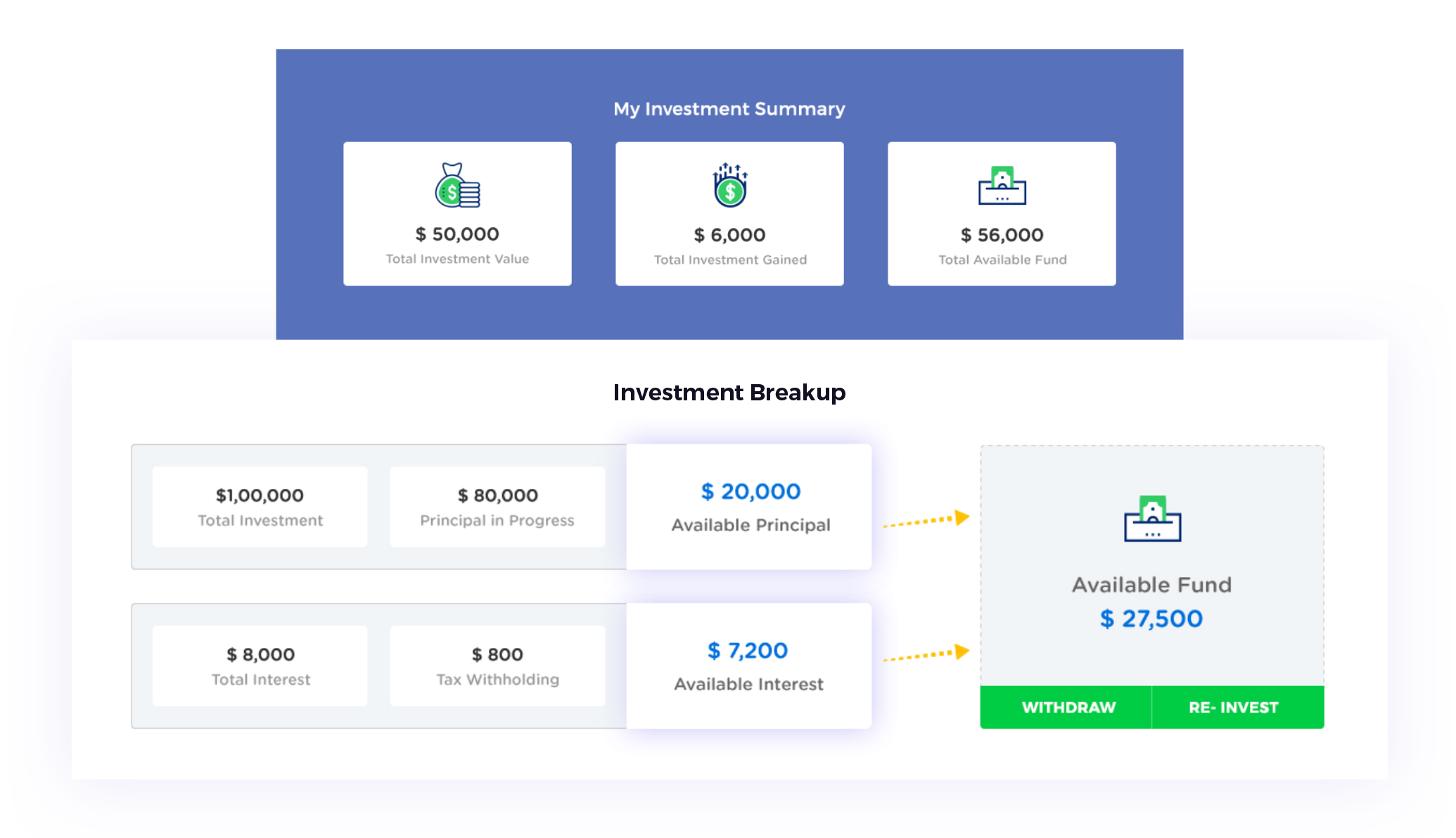
We wanted to build a product that gave control to the investors in terms of money, investment, and visibility to the entire process.
UX Strategy
A service offering crowdfunding for investment in real estate is a boon in times when property rates are sky-rocketing by the minute and yet real estate remains one of the safest choices for long term investments.
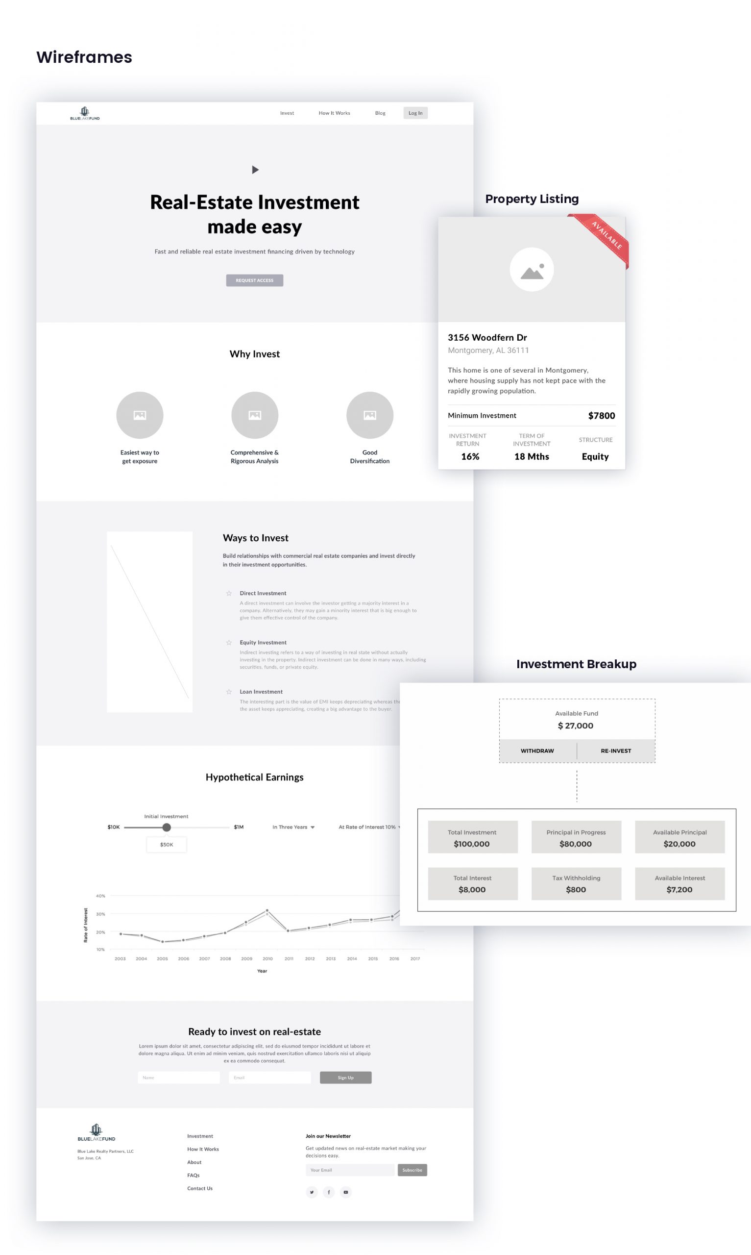
After conducting sessions with the stakeholders, it was clear that we had to structure the product to be in tune with the mental model of the users. User research directed us to build a product that users could trust instantly, as investing hard-earned money into any venture requires trust. We wanted to assure the users that their money was in the right hands.
After studying the behavioural patterns of potential buyers, we understood that they did not want to spend money and be dependent on a broker. We decided to use self-sufficiency and control as the key drivers for the user journey. The users could choose their preferred method to invest in the property of their choice. The use of filters was enabled them to find a property that fit their requirements quickly. There was no middleman or any extra charges involved in the process of the users choosing their ideal home. We wanted the investor to have control every step of the way to keep in sync with the big decision they were making.
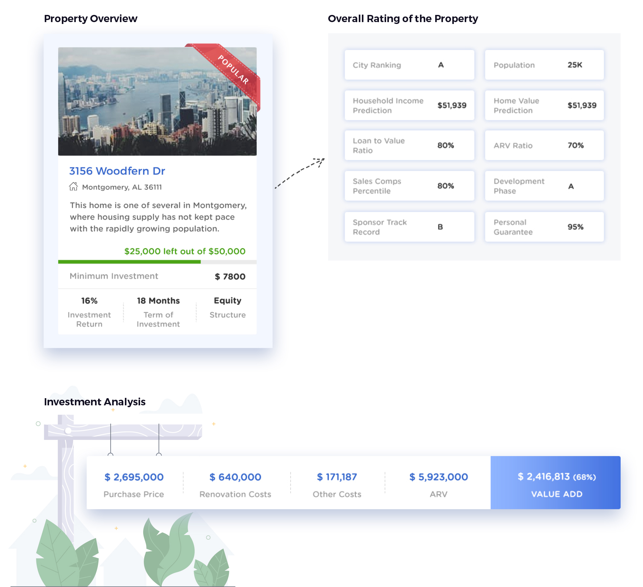
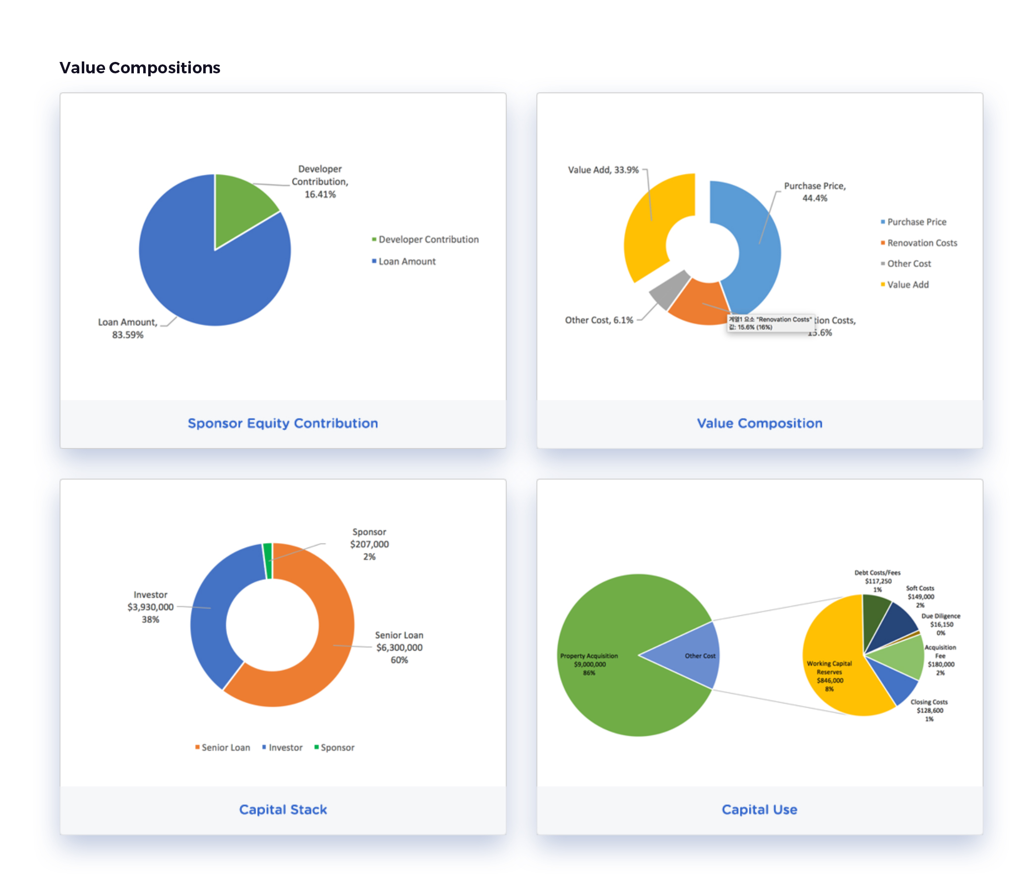
It was imperative to us that the users have complete visibility over all factors that could sway the decision-making process. A comprehensive and rigorous analysis of various important factors was made available on the website – market appreciation of the property, average household data in the selected neighbourhood, revenue composition, and so on. An overview of the property, along with the minimum amount required to start the investment, was made available on the details page on the website. To address queries, an FAQ page was also accessible to the users.
UI Design
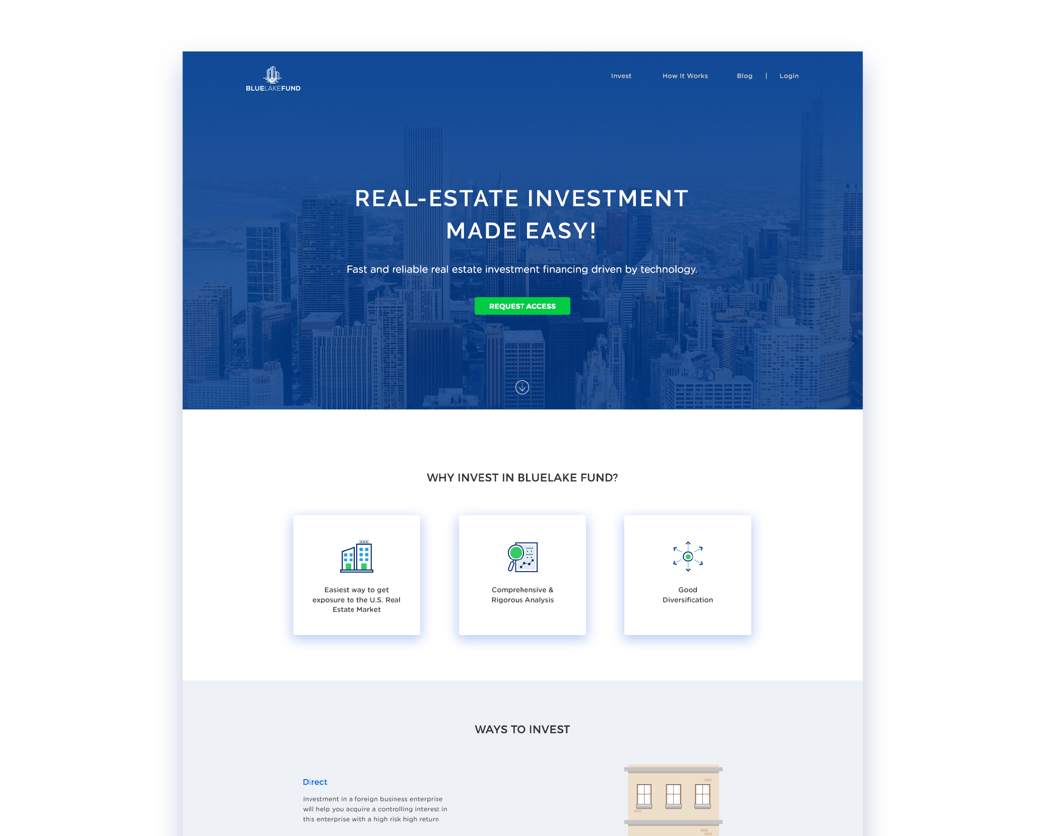
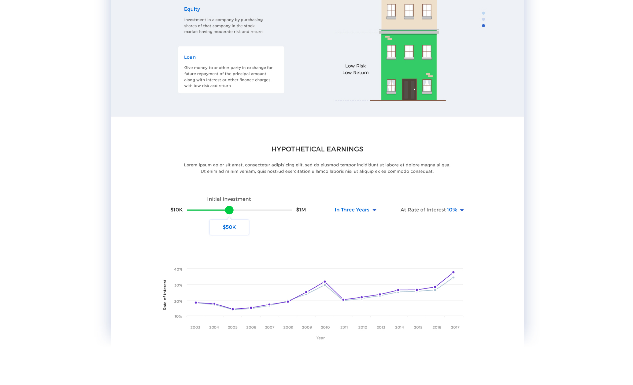
Congruent to our research and strategy, we designed the website with a clean and clutter-free layout to reduce the cognitive load on the users. All investment opportunities were presented in a card style layout with a small brief about the properties to gently ease the user into the process.
We included pictures of all properties to give the buyers a visual connect to the place. We used blue as the base color for the color palette to instill a feeling of trust and calm in the users. We wanted the screens to look visually appealing and to project an immediate image of ease-of-use. To propagate that feeling, we used a range of soothing yet muted colors to make the user feel comfortable while using the website.
Getting results & delivering on the promise is what we do best
The webpage was designed to emphasize the importance of investing in a well-selected real estate opportunity. Coupled with the aspect of crowdfunding, we built a product that was not only easily accessible to a larger audience but also served to connect the user with their ideal homes.


