GOT A UI/UX
DESIGN PROJECT?

Digital Art | Illustrations for Jewel Changi Airport, Singapore
the need
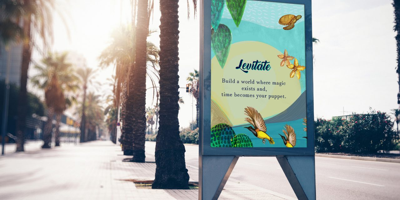
While undergoing renovation, Changi Airport (Singapore), wanted to brighten up the space under construction by installing creative hoarding designs around the space.
the challenge
The objective of these hoarding designs was to create the depth and illusion of space and enhance the dark ambience which was caused due to upgrading works. They would serve a dual purpose by not only brightening up the place but also serve to liven up the same for the construction crew at the location.
The designs had to be created in a way that they could be modular or implemented in parts, if required, without looking incomplete.


Final Hoarding Designs
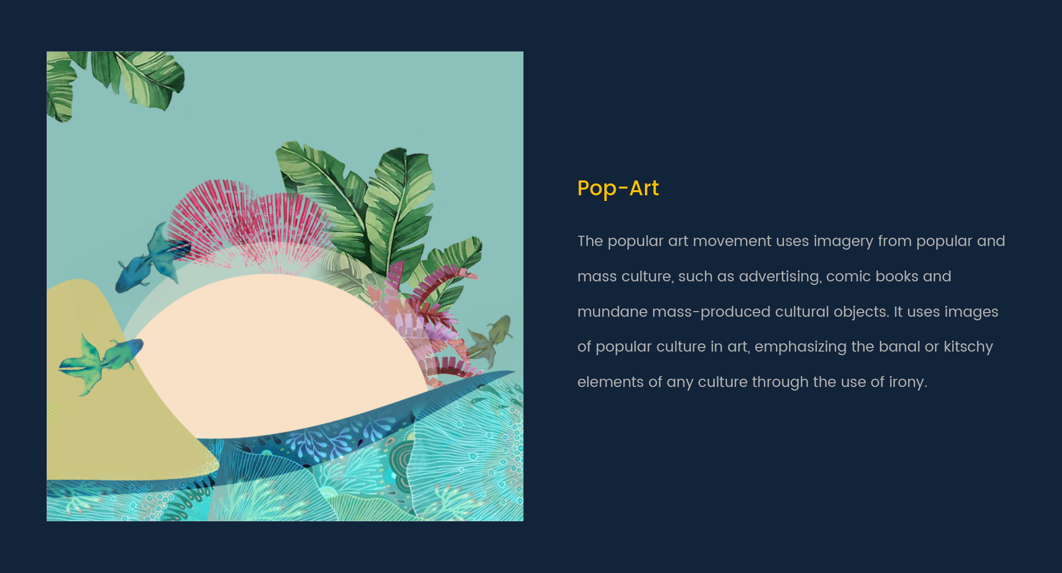
Pop-Art
To capture the spirit of Singapore, we chose local landmarks known the world over. They are also on the list of must-visit places for every tourist. The artwork for pop-art included Marina Bay Sands, Gardens by the Bay, Singapore Flyer, and a shrine which were offset against a clear blue to immediately catch the attention of any passer-by.

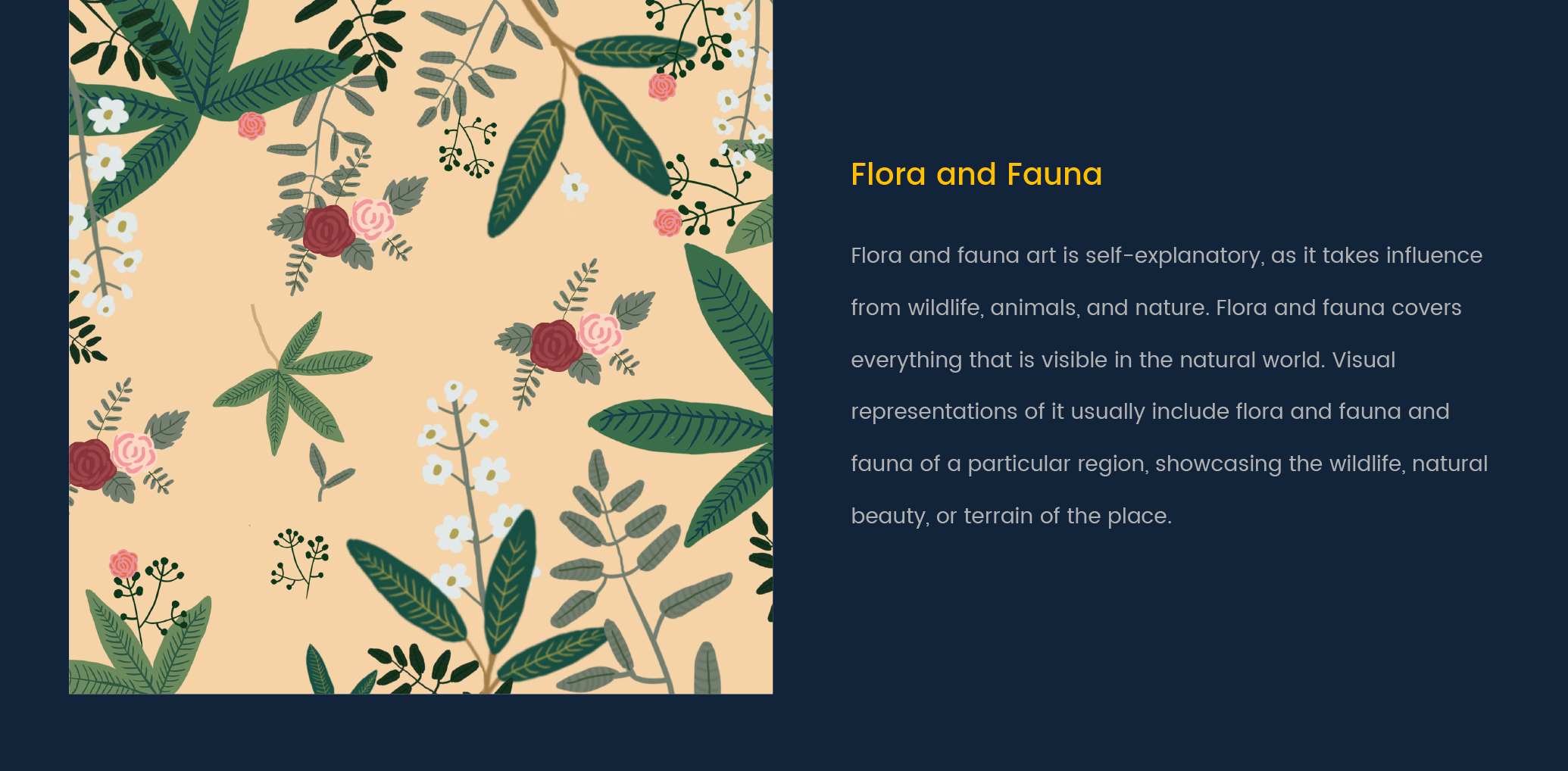
Flora & Fauna
For flora and fauna, we made a patterned artwork with a variety of flowers found all around Singapore. This bright and vibrant artwork was apart from being a visual delight also served to liven up the onlooker and contributed a sense of radiance to the place itself.

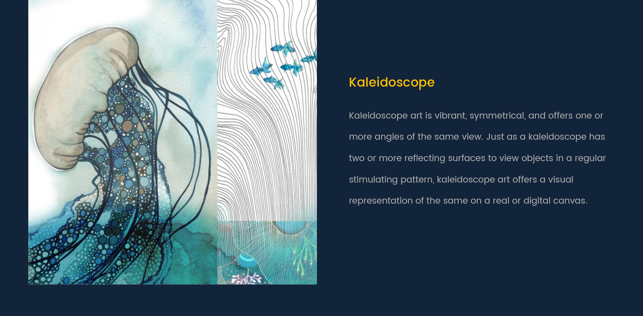
Kaleidoscope
To introduce a sense of wonder in all onlookers, we used a range of bright colors and went with a hand painted texture for this artwork. We took inspiration from the natural beauty that Singapore has to offer. The vibrant colors brought the artwork alive and gave it a stimulating look and feel(read more about the psychology of colors).

Getting results & delivering on the promise is what we do best
“We created bright, unique, and creative designs that fulfilled Changi Airport’s purpose exactly as intended. They lifted the atmosphere while filling up the space and introducing a sense of wonder and positivity.”
