GOT A UI/UX
DESIGN PROJECT?
Transforming UX for a Online Shopping Website – An Organic Store
Domain: Ecommerce
Platform: Web
Service: UX and UI Design
the challenge
A player in the online organic marketplace in the United States wanted to add value to their customers’ grocery shopping experience by turning it into a differentiating digital experience.
They approached us to define the UX and design the UI for their online shopping website.
the approach
We wanted to give consumers a reason to switch from traditional supermarket grocery shopping to an online grocery shopping website experience. Consumer demand for authentic brands is steadily on the rise and we aimed to achieve our goal by highlighting the organic aspect of all the brands and products that were offered by our client. We wanted to drive home the point that the groceries were ethically sourced, fresh, and organic in nature as opposed to homogenous name brand products available in every other supermarket.
UX Strategy
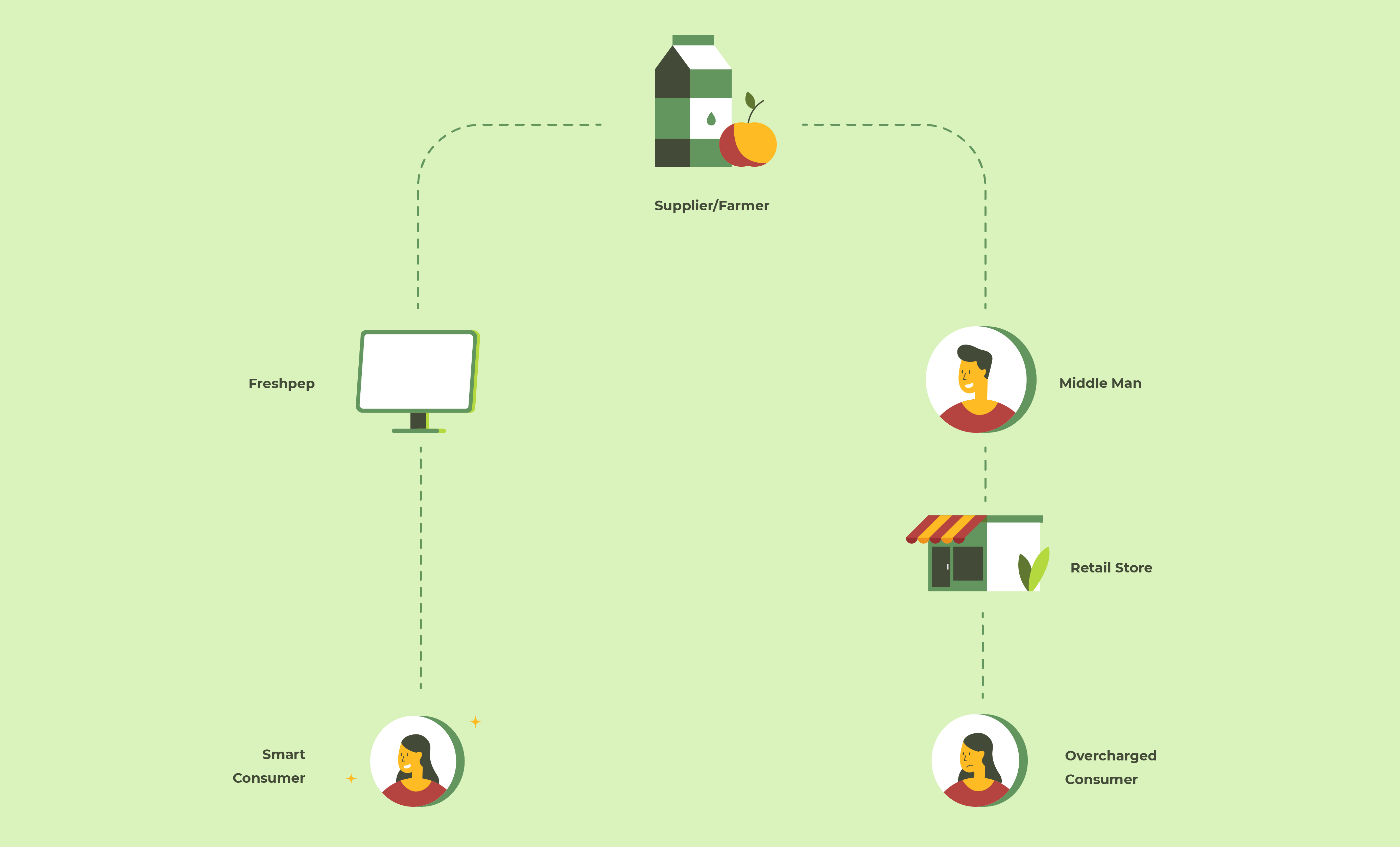
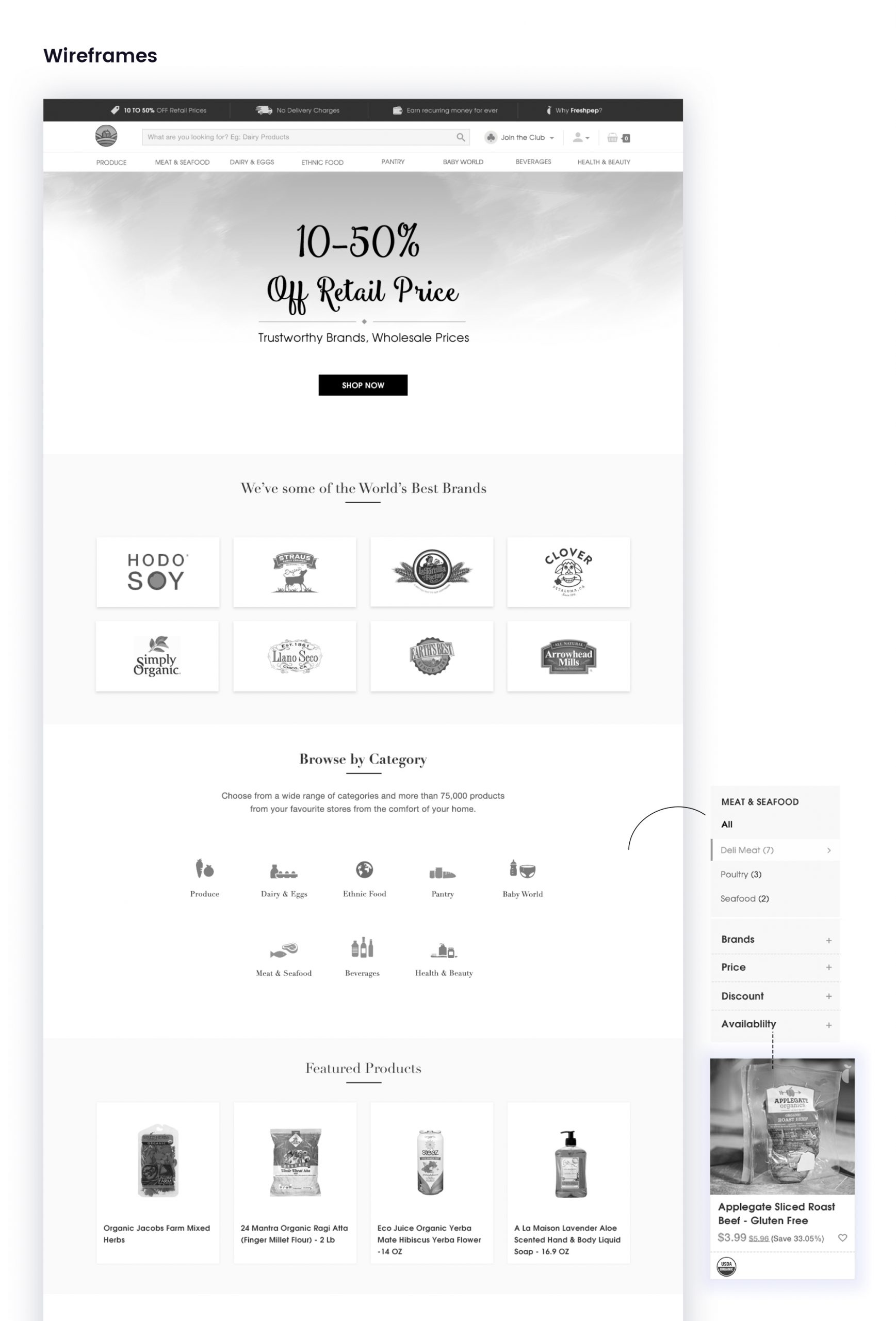
We planned our strategy in a way so that it would offer end users an enhanced online experience consistent with physical stores. Our aim was to channelize user journeys and make user tasks as easy as possible. While defining the UX for the site, our user experience designers limited the use of elements to minimise the cognitive burden. We wanted the user journey to be smooth and cohesive to make users realize that the time and energy they spent on grocery shopping physically could be used for other more productive tasks in their daily routine. We always kept a consumer’s mindset while defining our UX strategy. Which is why we highlighted incentives like discounts and subscriptions to special services to get new users started with their online grocery shopping experience.
UI Design
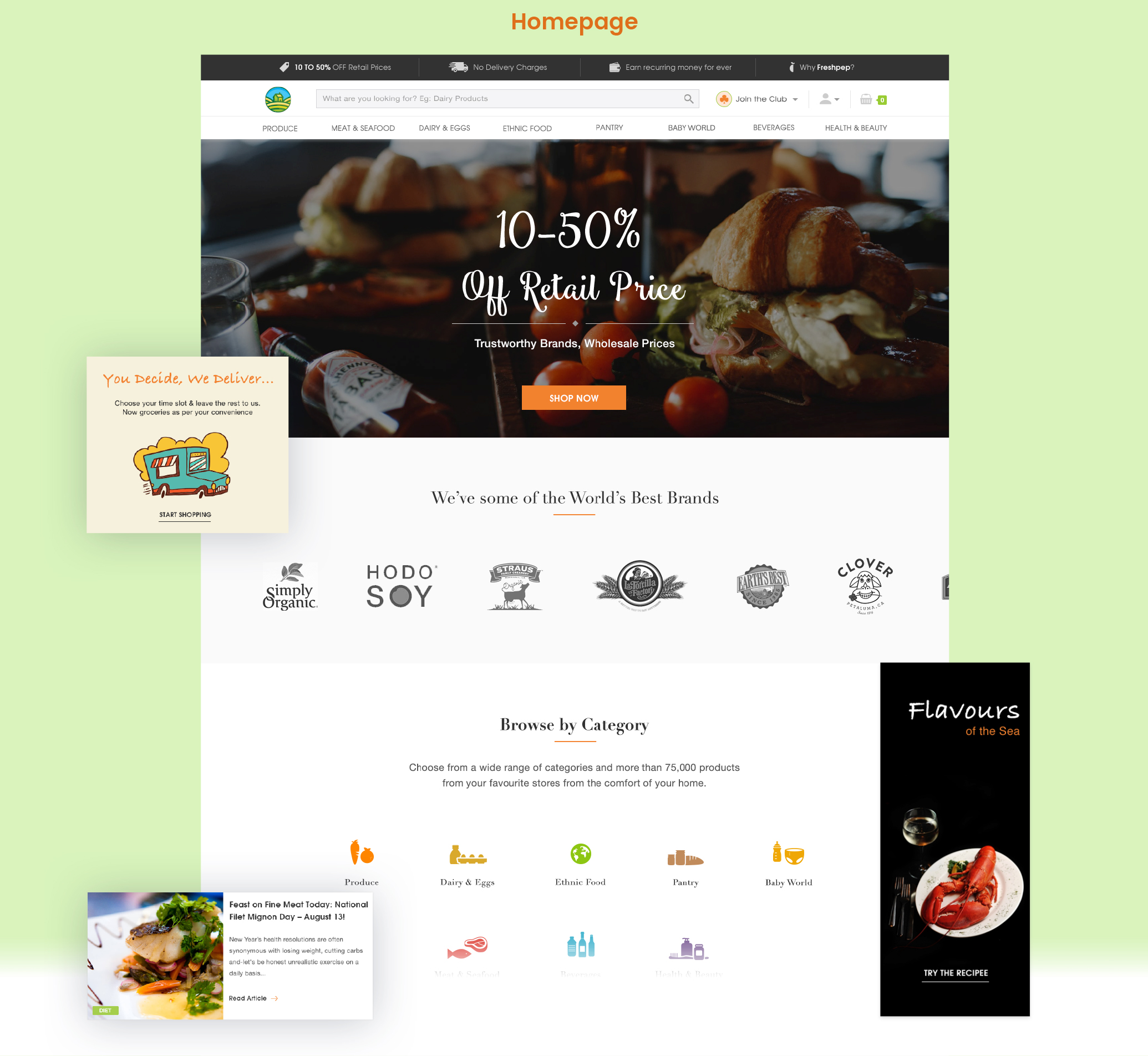
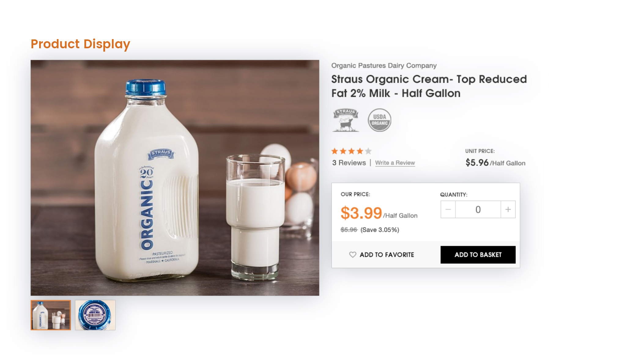
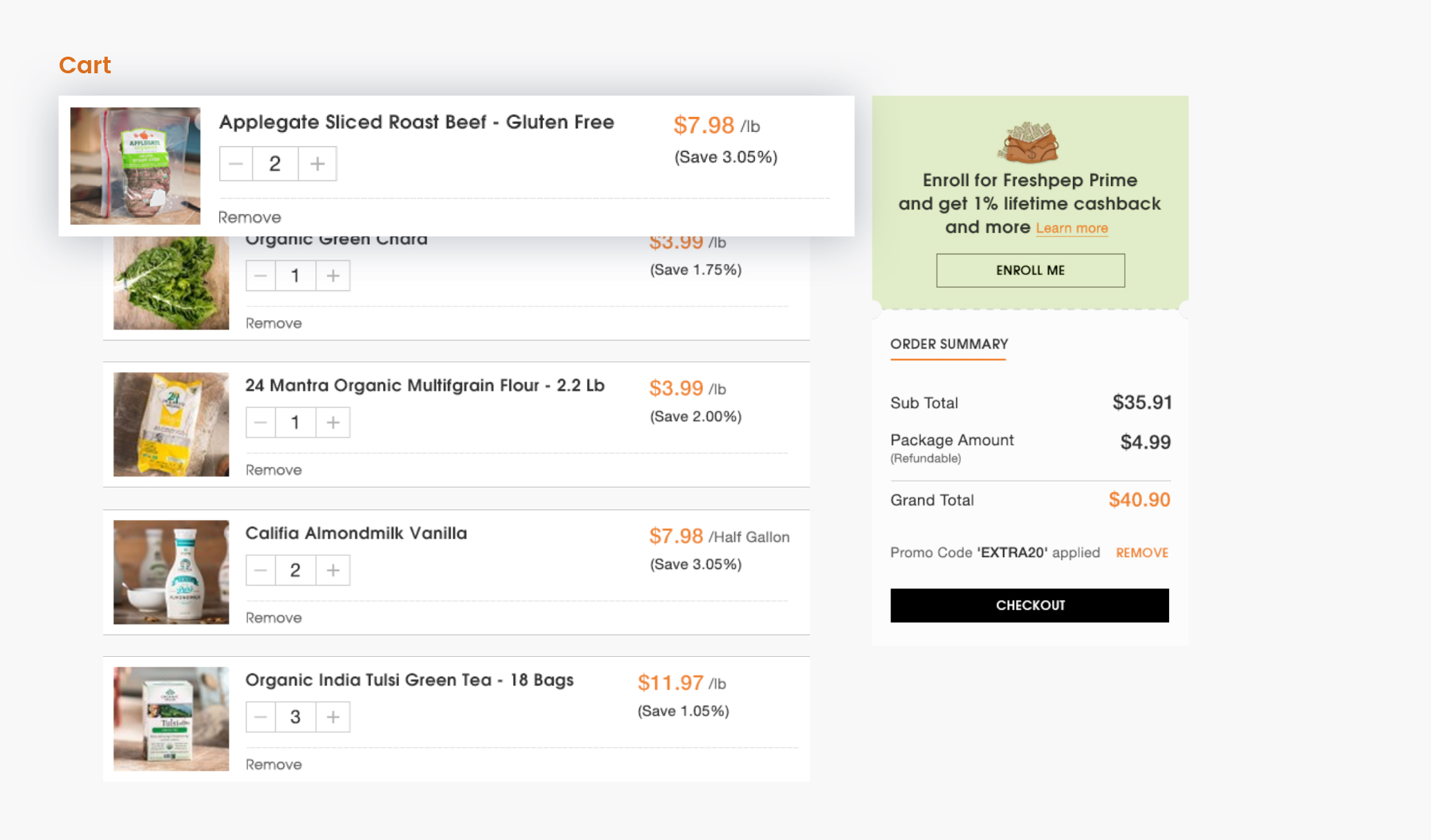
We recommended a simple and clean UI for our client with sleek, minimalist typefaces, distinguishable iconography, and a clean clutter-free layout so as to not overwhelm the users. The homepage was designed keeping in mind a sale. It showed the advantages of buying a product from our client’s site, the brand logos, various deals, recipes and news about the latest products. The content was presented in a clear and concise way to facilitate the user to add or subtract any items at the last minute.
Getting results & delivering on the promise is what we do best
Our partnership and rapid creative collaboration with Organic Grocery Store allowed them to shift and change as they were learning how consumers were responding to this new shopping experience. With the right creative design in place, and designing for trust got them to deliver a better user journey – and positive brand influence.


