GOT A UI/UX
DESIGN PROJECT?

OpenDoor Education – Revolutionising Classroom Learning
Domain: Education
Platform: Mobile
Service: UX and UI Design
THE CHALLENGE
Traditional modes of teaching have drilled into our heads that a successful pattern of education follows a
progressive course-wise approach – you learn the first lesson, move on to the second and so on. But what
if there is another way?
OpenDoor, an alternative educational platform, approached us to revolutionize classroom learning. They
wanted to create thinking classrooms – an environment where students could learn with a question based,
instant feedback and evaluation approach, before moving on to the next topic.
They came to us to design the UI and UX for their platform.
THE APPROACH
The learning approach for OpenDoor was different from regular education platforms. They wanted to make
sure that students were able to master every difficult topic taught in the class before moving on to the
next, especially for application-based subjects such as Maths and Science. They wanted to make learning
accessible to the young learner without the excessive reliance on electronic devices.
UX Strategy
User research showed us that children’s minds have a great range of stretch starting from 9 years old. Children from
that age onwards can engage in thought-intensive and logical tasks. This is also where a sense of competition and
achievement starts to develop in a child’s brain.
Traditional platforms favor a one for all approach in regard to learning. They move on to assessments immediately
after a few lessons (which comprise multiple topics), without taking note of whether all students have fully grasped
the concepts or not. This can result in poor results as every student learns at a different speed. What might be easy
for one student might be difficult for another. This can also cause a loss of morale if a student sees his or her peers
excelling in certain areas where they are lagging behind. This affects a student’s confidence and also makes them
give up on putting in the required effort in their studies.
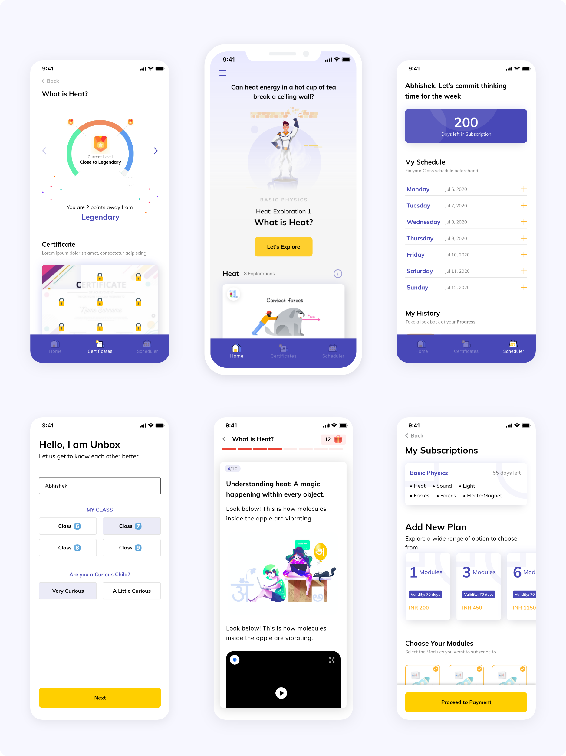
OpenDoor wanted to do things differently. They wanted students to become a master of each topic through a series of
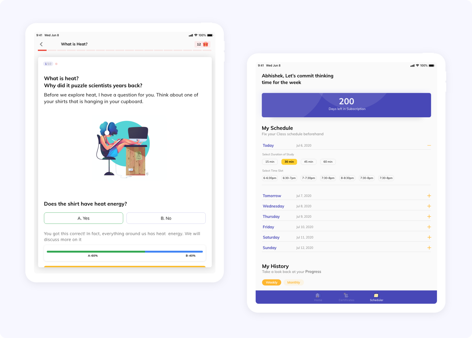
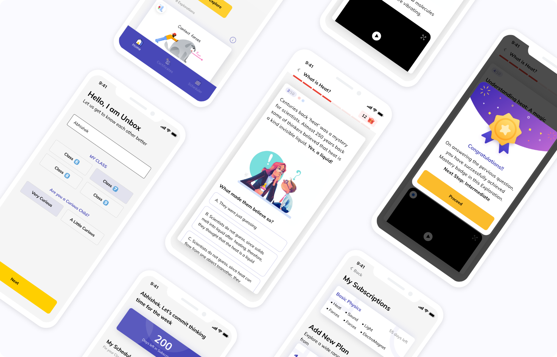
gamified discussions. After learning the basics of a new topic, students were asked an example-based question. The
students who answered correctly earned points and moved on to the next section of the topic progressively. Students
who did not get a proper understanding of the basics had to take the lesson again to build a foundation of the topic
before moving on. This instilled a sense of achievement that made the students actually pay attention to gain more
points and move to the next level. What it did additionally is to create a solid foundation of the topics learned in
children and gave them practical, useful knowledge of the topic instead of just theory. Once the students
successfully finished all modules on a particular topic, they were given a certificate of mastery which solidified their
sense of achievement.
We also created an environment to instil discipline and consistency in students by introducing a timetable. The
students could set up their own timelines to complete topics and receive points for adhering to their timetables.
This setup worked to ingrain a sense of schedule, and time management and also rewarded the children for being
consistent with their studies.
We wanted to create thinking classrooms where teaching began with a question and students were taught in an
example-based, question format instead of statement-based learning. For example – ‘If we did not eat fruits, we
would fall ill regularly’ is the answer to the question ‘What if we did not eat fruits for a year?’.
Wireframes
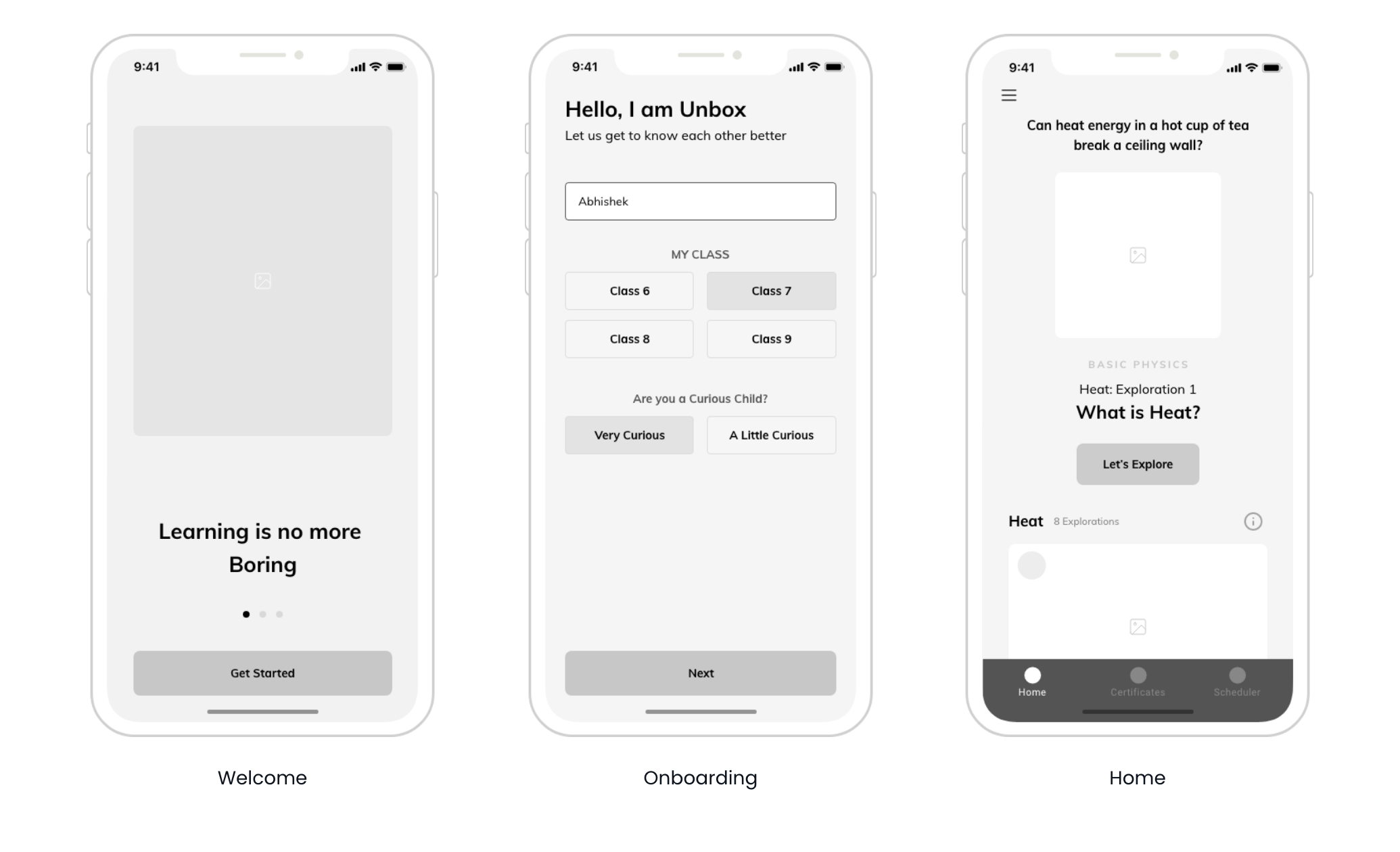
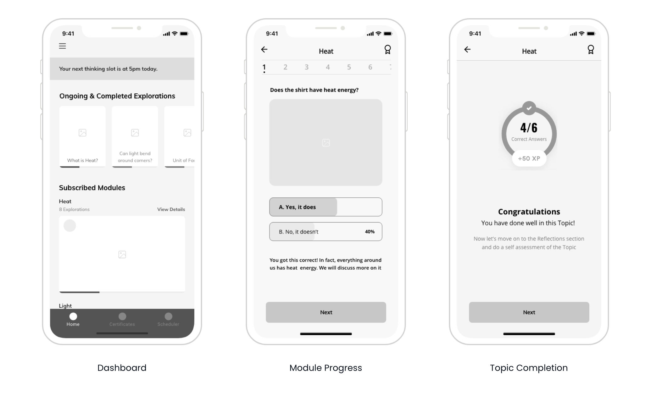
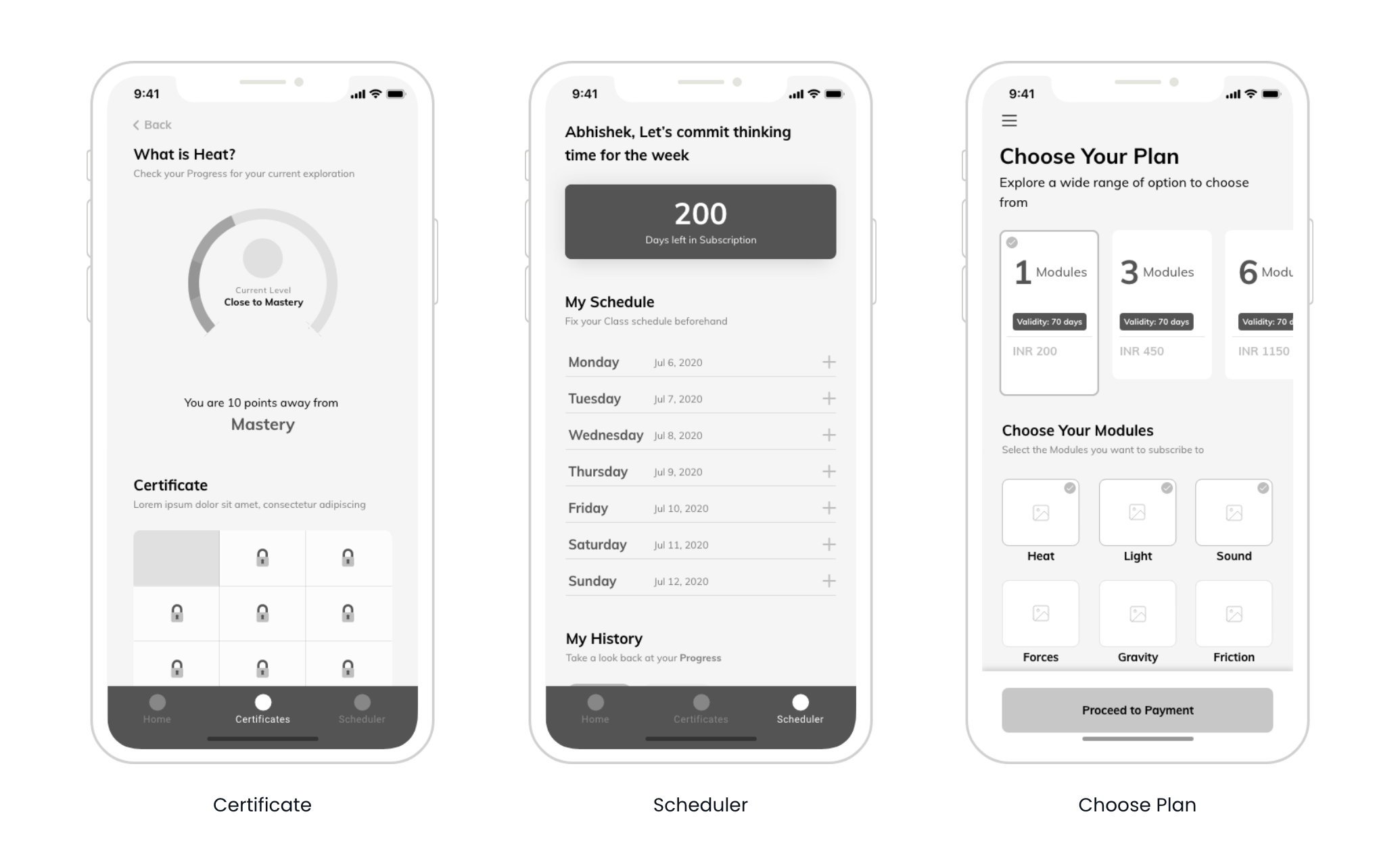
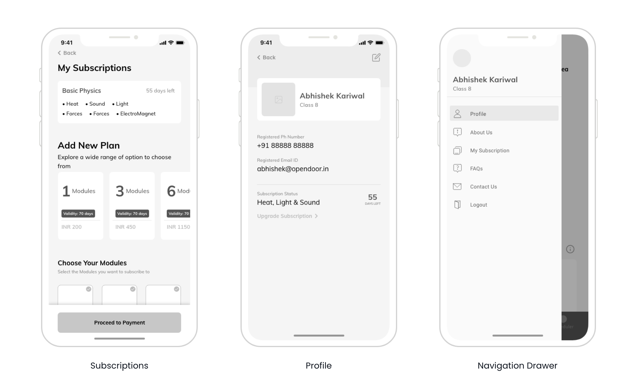
UI Design
As the education platform was an aid for young learners, simple and minimal design elements were the key. This was necessary as our aim was to create a distraction-free environment where the students could master the topics quickly and easily. An all-white background with shades of grey text could cause disinterest in young learners, which is why we used a mix of colorful illustrations, animations, and thought-provoking content to retain the interest of the student learners.
It also helped them create distinctions and navigate through the platform more easily!
Delivering on the Promise
Our end goal was to make the application as easy and
intuitive as possible to increase user retention and give
the parents a sense of trust and make learning fun and practical for the students.

